Your brand image tells someone who you are at a glance. Your logo, the content you post, what you say, and the fonts you use to say it – they’re all part of your brand. Ask yourself – are you telling the story you want to tell
Whether you’re just getting started or it’s time to revamp your brand image, here are branding tips from design expert Danielle LaBonté.
What’s ahead?
- Five things you should have on your website
- Go-to design apps
- Three tips for designing your logo/brand look
- How websites and branding can support business growth
- How Danielle pushes creative boundaries
- Danielle’s process for telling a brands story in their design
Meet the expert
Danielle, you’re the Founder of Danielle LaBonté Designs – a design studio known for pushing the boundaries of creativity and branding. What made you decide to start your own design studio?
I decided to start my own design studio out of passion for being creative and meeting like-minded people. Through operating my studio, I work with so many different entrepreneurs who allow my creativity to meet new challenges and heights. Although I had worked for people before starting my own studio, I found I really enjoyed taking control of projects and having my own voice. I enjoy project management on top of being creative so starting my own studio was the best way I could take those skills and feel fulfilled at the end of each work day or week.

Branding tips
Five things that every brand should have on their website?
Every brand should have the following elements on their website:
- Call to Actions! If each section doesn’t prompt someone to book, get on a call, go to the specific page to learn more, find you on socials, read more about you, you’re not helping your future client to ensure a seamless user-experience.
- Clear and Concise Headlines / Navigation. This means copy in general as well that will be included on your website to communicate to users. Headlines and copy should not be hard to follow, it should be easy and most of all, simplified! Users don’t want to read through or click a series of buttons in order to contact you.
- Supporting Images. This means imagery should be present on every single website page and it should be consistent on each page (the filter, the people shown, the workspace, etc). Images are a universal way of captivating an audience without having to read copy. PS. Images should have some sort of SEO integrated!
- A Contact Form! The easiest way for someone to inquire is to allow them to fill out a form and you will then do the work from there. If someone’s interested, they shouldn’t have to do the work to get a hold of you. A repetitive pattern in what a website should have is ease of navigation.
- Success Indicators or Testimonials. This is such an easy way of letting people know you have a wonderful reputation and others have no problem expressing how grateful they are for your services or products! Consider what can you guarantee or what have people said?

What are some of your go-to programs/apps for digital design?
I am an Adobe Creative Cloud designer through and through, there is an app for any form of design you’re looking to pursue and it will come out authentically and professionally. If you’re looking to pursue digital design professionally, the investment is worth it! If I am looking to create digital art outside of Adobe, I run to my iPad and draw on Procreate. If you’d like to upscale your social media presence, easily editable and high-quality designs can be made in Canva.
Three tips for a new brand designing their logo/brand look?
- Understand Your Target Audience! I think the most common mistake I see is that the automatic assumption is to always design based on what “we” the entrepreneur or company likes. Although we should consider it in the design because it’s what makes us unique, it should not be the driving factor. Instead, what does our dream customer want to see? What would they want to pick up off the shelves? What would they want to consider before investing? There are so many things that should be considered here about your target audience and persona.
- Establish Your Brand Adjectives. I always ask this of my clients, I find this is so crucial in understanding the brand mission before you even hop into designing a brand identity. Without understanding the objectives and driving factors, we lack knowledge about our own brand. Therefore, we do not have the basic knowledge before we hire or try to design our own branding.
- Your Branding Is More Than a Logo. We need to create experiences for our customers. If we lack an amazing client experience from the discovery call, to our social media, to our website, we aren’t doing our job. If you’re going to invest in a logo design, I recommend investing in the entirety of it. The colour scheme, font selections, brand messaging style, collateral/stationery, social media presence, and website development and design.
Since starting your design studio in 2017, you have worked with clients on a global scale. How has your own website and branding supported your growth?
My website and branding helps bring forward my brand mission. Without either of these tools, I wouldn’t be able to portray my work, what my studio has to offer, and how we can help other businesses grow as well. I feel like in modern society and the way marketing is growing, we absolutely need a strategy that will support and grow with us. Brand design + strategy incorporates a thoughtfully curated website. Each element provides clarity and consistency that someone needs to feel before even inquiring. My studio wouldn’t be where it is today if I didn’t put thoughtful consideration into my own online presence.
 As an award-winning graphic designer, how do you push creative boundaries in editorial and advertising design?
My style is forward-thinking versus hopping on trends. I would rather design a magazine or advertisement for a brand that feels modern than something that we see on every other brand out there. I am also an absolute lover of typography – a lot of work on our end goes into ensuring typography is high-end and modified to feel custom-tailored to the look we’re going for. Editorial and advertising design relies a lot on how an image/design can communicate an emotion and how the typography can enhance the message further. We love working in layers to ensure designs aren’t flat. Design work should feel more than two-dimensional when looking to attract buyers or clientele.
My style is forward-thinking versus hopping on trends.
We play around with so many potential possibilities before moving forward with a design to ensure all creativity is being met. I come from a background in research, primarily in Art History & Architecture, so lot’s of time is spent in the brainstorming and research phase to learn more about the design topic we are working on. Without this step, I believe we’d lose out on valuable understanding and presentation.

Laslty, what is your process for conveying your clients’ story in their brand design?
We strategically put in place three steps that we can’t work without in order to convey our clients’ story in their branding.
First being that initial discovery call. We set up complimentary 30 minute calls to get to know the client and as well breakdown how we work. In this call we find it important to ask why they started their business and what makes them unique.
Second, we send over a brand questionnaire that will allow us to learn more about them and dive even further into their brand-knows. This is where we ask about their mission, target audience, brand adjectives, their why, what they like and don’t like, competitors, etc. From here, we progress further into an in-depth research phase where we pull pieces of information that can add to their story and reflect into brand design.
Lastly, we brainstorm and this looks a little different than what most see online for the finished product. We story-map and draw out what we think the brand would look like and talk about from beginning stages to final stages. This looks very much like a progression map where we walk through different “stages” and “life choices” of the brand. Finally after all of this, we get into the digital design of it all and hit our Adobe programs.
Use these tips to create a brand image that tells your story!
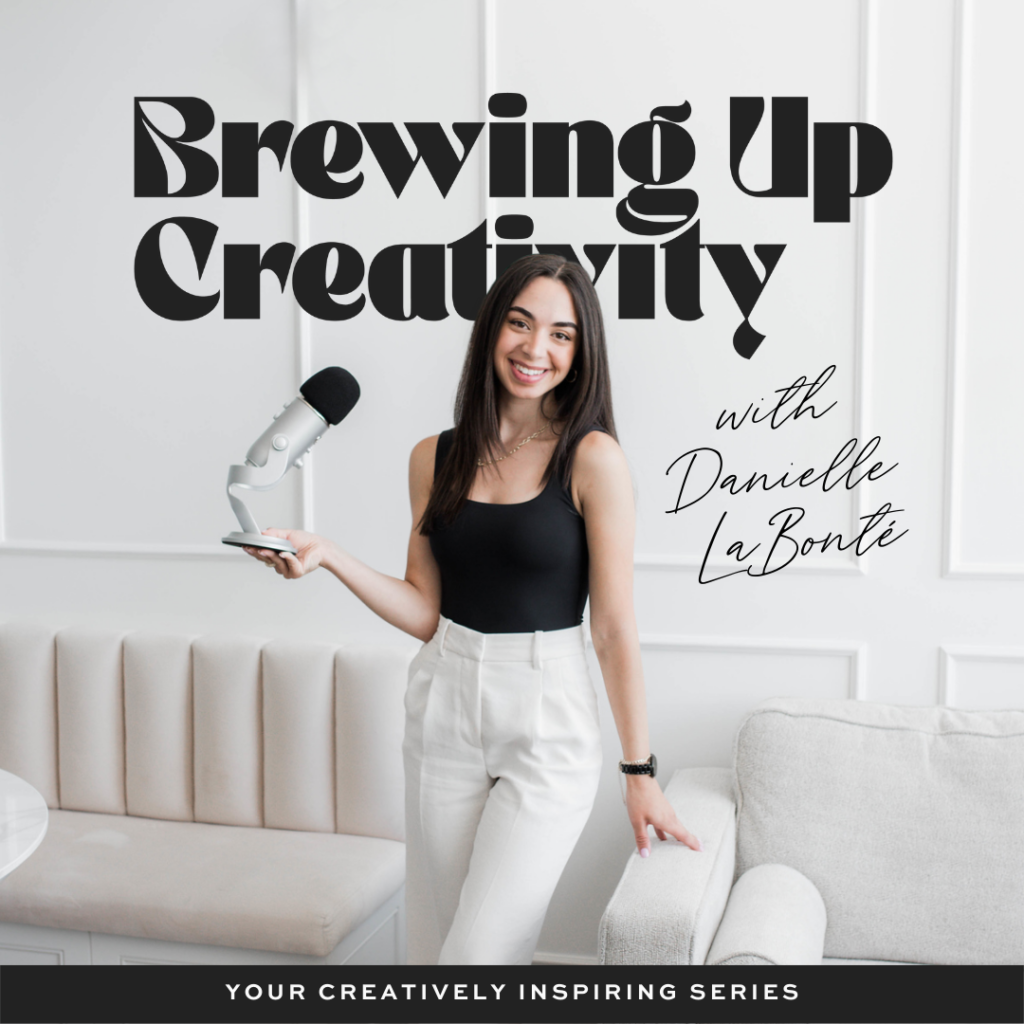
For more tips, check out Danielle’s podcast, Brewing Up Creativity – a space focused on inspiring, motivating and supporting creative minds – where you can hear what our Account Director, Shanley Gibb, had to say about the future of influencer and social media marketing.
Head to Samurai Media’s Instagram for more tips on all things social.


