YouTube video title: “How to gain viewers by using these easy thumbnail creation tips!”
Are you a content creator on YouTube who is lacking views and subscribers? Maybe it’s time to take another look at your most recent video thumbnail and see how you can make it more enticing to potential viewers. Not sure where to start? We’ve got you covered!

Why should you put effort into your video thumbnails?
Creating a cover photo (or in YouTube terms, a thumbnail) for your YouTube video is an important step in uploading new content to your channel.
A thumbnail that is eye-catching to your viewers and potential new subscribers increases views and holds the opportunity to grow your audience.

Call Her Daddy / Youtube
Pose for the Plot
We know your new video thumbnail includes a photo. Whether this is a photo of yourself or an image of the content your video is about. Nine times out of ten, influencers are the face of what they are discussing or selling. So to create an eye-catching thumbnail, try taking a selfie with a facial expression. Depending on what the video is about, your selfie can look shocked, sad, happy, or excited. And this doesn’t have to be with the same background for every thumbnail. You can switch it up based on the theme of your video, like the below.
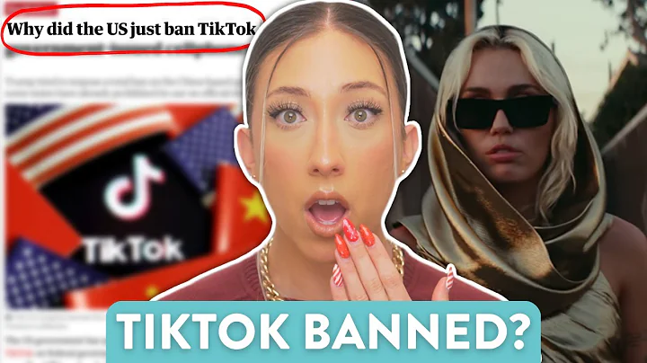
Modern Millie / Youtube
Graphics Galore!
Now, we are not saying to overwhelm your thumbnail with graphics. Too many graphics can look busy and take away from the text. But the key is to use graphics to inform your viewers what your video is about. Depending on your brand or niche, the graphics and colours in your thumbnails can be the same every time, or you can cater them to the theme of your video.
Pro Tip: Have fun and get creative! Add graphics and colours that you enjoy. Your content is firstly for you to love and then your audience second. Just remember to follow your theme/brand. Although we’re sure you won’t forget that.
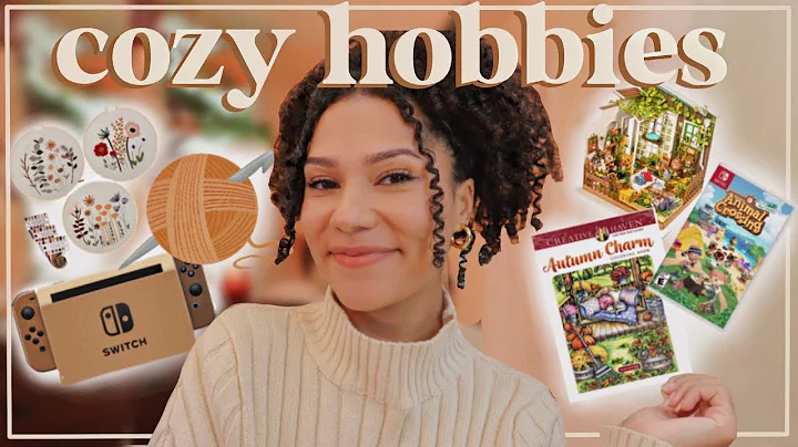
Cozy K / Youtube
Text is Enticing!
A YouTube thumbnail doesn’t only include fun photos and graphics. It should also include interesting text that captures your viewers attention. Text that goes along with the title and the overall theme of what your video is about.
For example, if you are creating a video about tips for staying organized, you may want to place text in your thumbnail like “The habits I broke to stop procrastinating for good!”. This text is not only relatable to potential viewers who have struggled with organization and procrastination, but it also gives your viewers a sense of belief that they will be able to achieve their goals by watching the video. If you’re lucky, they’ll subscribe to stay in the know about new content.
Pro Tip: To capture those SEO results and support your search ranking, include keywords in your thumbnail text, in addition to your video title.
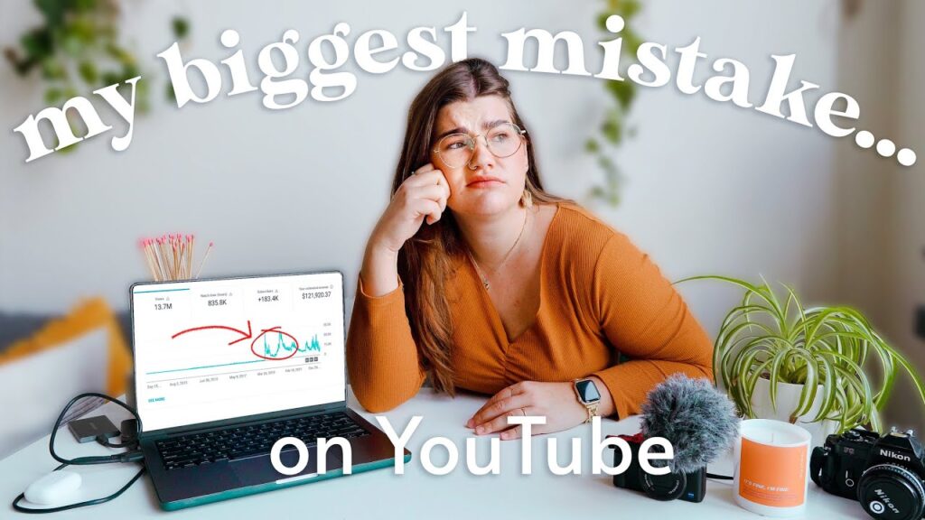
Katie Steckley / YouTube
We want this blog to be worth a read for you. Like a YouTube thumbnail, we want to hook you in and leave you at the end of the video learning something new that you didn’t know before.
Here are your key takeaways:
- Have your main image be the focus of what your audience can expect from the video.
- Match your colours and graphics to your brand and the theme of the video.
- Add eye-catching text that will reel in your viewers to click your video and learn more.
We hope we sparked the inspiration for your next YouTube thumbnail design. Now that you know what to include, get creative!

What Platforms To Best Market Yourself On and Your Brand: (Part 2)
Discover how to reach new audiences with your niche on Pinterest, YouTube, and LinkedIn!

What Platforms to Best Market Yourself on And Your Brand: (Part 1)
Let’s explore how you can make the most of your digital presence and reach your goals.

Decoding The Social Media Puzzle: Where To Post Content
You work hard on creating your content, and to get the best results from it, we want to make sure you are posting it to the social media platform that will have the most success. Find out more to receive all the knowledge!
